What Makes a Resume ATS Friendly in 2026 (Most Still Aren't)
The Silence Isn't Personal
You apply. You wait. Nothing comes back.
No rejection. No confirmation. Just silence, and the slow creep of doubt that maybe you weren't qualified after all. Maybe your experience wasn't good enough. Maybe you said something wrong.
Here's what actually happened. A piece of software read your resume before a human ever could, and it didn't understand you. Not because you weren't qualified. Because the file you sent was never built to be read by a machine, and the machine doesn't ask twice.
That's the quiet cruelty of modern hiring. You did the work. You wrote the resume. You hit submit with something close to hope. And a parsing engine mangled your job titles into gibberish before a recruiter ever opened the tab.
What an Applicant Tracking System Actually Does
An applicant tracking system isn't smart. It's not reading your resume the way a person would, top to bottom, forming an opinion about who you are.
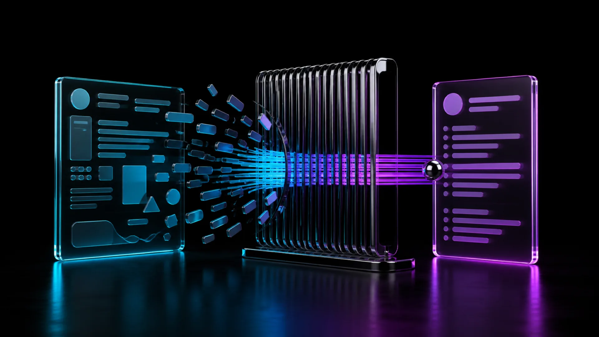
It's extracting text. Dates. Titles. Skills. Education. Then it's trying to sort that text into fields so a recruiter can search and filter thousands of applicants in seconds instead of hours.
When the extraction works, you show up correctly. Your title reads as your title. Your dates line up. Your skills match the keywords a recruiter searched for.
When it doesn't, you disappear. Not rejected. Never seen.
Resume parsing fails constantly, and it fails in ways that have nothing to do with your talent. A two column layout confuses the reading order. A text box hides your work history entirely. A fancy header graphic swallows your name and phone number whole. The system doesn't flag an error. It just gives up quietly, and your application sits there looking complete while being functionally empty.
The Format Fight Nobody Should Be Having
Somewhere along the way, resume design became a competition. Icons for skills. Color coded sections. Two column layouts that look sharp in a portfolio review and fall apart in a resume screening system.
That's the tension nobody warns you about. The version of your resume that looks the most impressive to a human is often the exact version an ATS cannot read.
Design for one, and you lose the other. So the honest answer to what makes a resume ATS friendly in 2026 has almost nothing to do with how creative you can get, and everything to do with restraint.
An ATS friendly resume is boring on purpose. Single column. Standard section headers like Experience and Education, not clever renamed versions. No tables. No text boxes. No headers or footers holding critical information the parser will skip. Fonts that exist in every system, not the elegant one you found last week.
That's not settling. That's understanding your audience. The system reads first. The human reads second. You build for both, in order.
The Free Template Problem
Search for an ATS friendly resume template free online and you'll find thousands of them. Most look clean. Most will still break you.
A template built for visual appeal in a design tool doesn't automatically translate into an ATS compatible format once it's exported and uploaded. The columns that look tidy in the preview can scramble into nonsense the second a parser tries to extract them in reading order. A template being free or popular tells you nothing about whether the system reading it will actually understand what it's looking at.
We built Orbyt because watching a genuinely qualified person get filtered out by bad formatting felt like a failure that shouldn't be allowed to happen quietly. Not a slightly better resume builder. Something built from the parsing engine backward, so the file you send is readable by the software standing between you and the person who'd actually want to hire you.
What Actually Matters
If you want to know how to make your resume ATS friendly, stop thinking about decoration and start thinking about structure.
- Use standard headers the system expects to find
- Keep everything in a single column, top to bottom
- Save as a docx or a simple PDF, never an image or a scanned file
- Spell out both the acronym and the full term at least once, since some systems only match one
- Match the language in the job posting where it's true, not where you're stretching
None of this is exciting. It's not supposed to be. The excitement belongs in your accomplishments, not your font choices.
And look, I've seen resumes get rejected for having the audacity to use a header graphic with the person's name in it. That's bullshit. Someone spent real effort making something look professional, and a parser threw it out because it couldn't find a name field. The system should be smarter than that. Until it is, you have to build around it.
Why This Actually Matters
A resume screening system doesn't know you stayed late for two years to fix a broken process nobody else wanted to touch. It doesn't know you mentored three junior hires who are now doing your old job well. It only knows what it can extract, cleanly, in the format it was trained to expect.
So give it something to work with.
Your resume isn't a design piece. It's a translation layer between the work you actually did and the person who might finally get to see it. Every ounce of creativity you'd normally pour into layout, put it into your accomplishments instead. Let the format disappear so the substance can stand alone.
The best resume isn't the one that looks the most impressive sitting open on your screen. It's the one that survives the trip through the system untouched, arriving on a recruiter's desk exactly as clear as the day you wrote it.
That's the whole job of an ATS friendly resume. Not to impress the machine. Just to survive it long enough to reach the person who never should have needed convincing in the first place.
Related research